Friday, January 8, 2021

Website - Draft 2

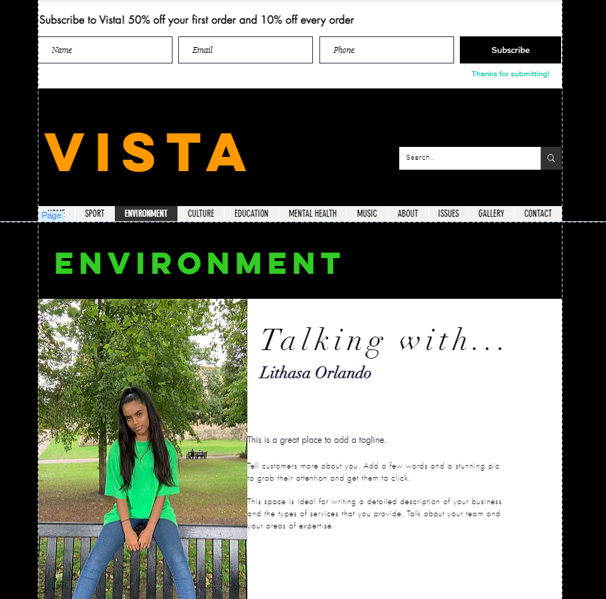
I have changed the branding of the magazine so carried it over to the website. 

Black and orange being the main colour palette makes the magazine and website very striking to readers, the two colours contrast each other well and it looks more sophisticated than orange being the main colour page.


Tuesday, January 5, 2021

Front Covers - Draft 2

I decided the orange border didn't look professional and the colour palette just wasn't working well, so I changed it to black, made it smaller, and changed the masthead to orange to create a striking brand identity across the platforms.

I have tied in accent colours of the image to gain the attention of the audience and make the front cover aesthetically pleasing. 

The colours on the bottom of the page link with the colours on the website to maintain the brand identity and shows the audience which issue they are reading.


Monday, January 4, 2021

Contents Page - First Draft

To incorporate the brand identity on the front cover, I have included the orange border again.
 
The format of the masthead is also present on the contents page, to remind the audience of the brand identity. 

The titles of each section will link to the colours on the website to create a colour coded system for navigating the topics of news on the website.

The contents has a page number next to it, which links to the news story on that particular page, but also links to some images on the opposite page. This allows the audience to see photos of the news story they are reading about.

Including social media icons and usernames allows the audience to engage further with the product, by interacting with posts by, liking, sharing and commenting, as Henry Jenkins suggests 'if it don't spread it's dead'. There will also be the website address, creating digital convergence so the audience can read more content online.


Sport Issue - Choosing between Images

I took 2 potential front cover photos and couldn't decide which one to use so constructed a magazine front cover draft of both images to see which one looked best. I prefer the first image, due to the low angle shot making the model look dominant and superior, and the colour palette of yellow works much better. 


Tuesday, December 15, 2020

Front Covers - Initial Draft

I chose to include a border around the image to allow the magazine to stand out, as other magazines generally do not use borders. 
I chose orange as the main colour, which is also present on the website creating a clear, strong brand identity. It is a unique colour that not many companies use, and it would stand out and catch the audience's attention on a magazine shelf.


Website Walkthrough

Website Walkthrough