Sunday, September 27, 2020
Wix Homepage - Initial Draft
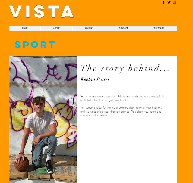
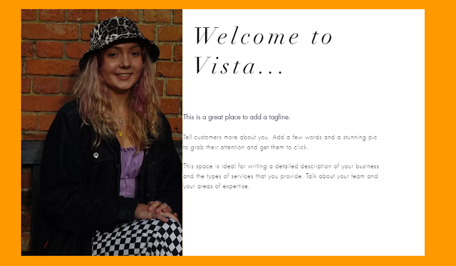
The first square shows the design when the audience hover over it, which is more interactive and aesthetically pleasing, however I also like the design of the squares below, so will decide on the best design at a later date.
I chose to use orange as the main colour to allow the branding to stand out, as it is a unique colour that not many companies use, and it would stand out and catch the audience's attention and make it different.
Sunday, September 6, 2020
Initial Footage Documents - Issue 1 + 2 and Website
https://drive.google.com/file/d/1S4bgCRP6pdYu76pjiqzhcJNSbqk7aV1v/view?usp=sharing
https://drive.google.com/file/d/1GYRNt7AoPPo25qsuCyXE4vUyFKnE9DRw/view
https://drive.google.com/file/d/1tCeCuaju476RkUqNTrKNVII-LrpTP3xs/view?usp=sharing
https://drive.google.com/file/d/1D73MXgZmtwhkuIU5UvlzTCUtL2NdUGC0/view?usp=sharing
Subscribe to:
Comments (Atom)
Website Walkthrough
Website Walkthrough
-
Website Walkthrough
-
How do you intend to use the four areas of the media theoretical framework to communicate meaning and meet the requirements of your chosen...
-
To incorporate the brand identity on the front cover, I have included the orange border again. The format of the masthead is also present ...


