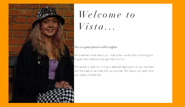
The first square shows the design when the audience hover over it, which is more interactive and aesthetically pleasing, however I also like the design of the squares below, so will decide on the best design at a later date.
I chose to use orange as the main colour to allow the branding to stand out, as it is a unique colour that not many companies use, and it would stand out and catch the audience's attention and make it different.


No comments:
Post a Comment