How do you intend to use the four areas of the media theoretical framework to communicate meaning and meet the requirements of your chosen brief? (approx. 400 words)
Product 1 - magazine
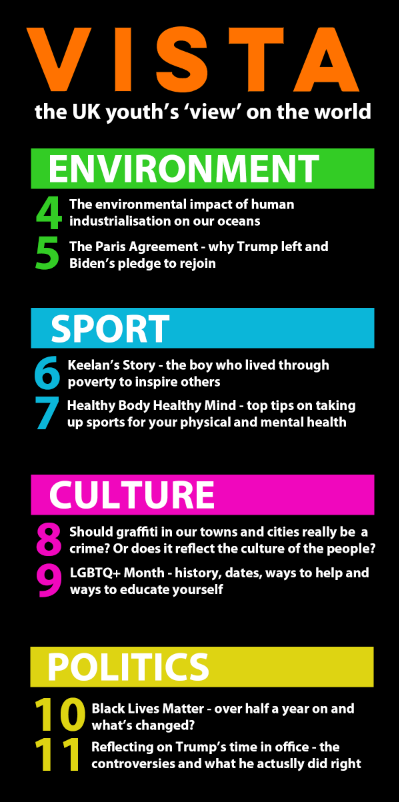
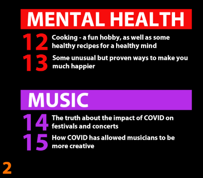
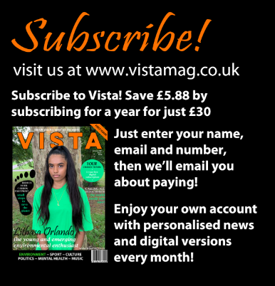
I intend to produce a current affairs magazine called Vista aimed at a 16-25-year-old socially conscious audience. From my research into magazines, I found many common codes and conventions across them, as I studied The Week, The Big Issue and Prospect. They use a bright uniform colour palette and brand identity across all products and platforms, as seen in ‘The Week’, who use bright red branding, a large bold masthead, a slogan, cover lines and a bright powerful image on the front, of which I intend to use all of them. All this combined grab the attention of the audience, enticing them and encouraging them to buy the product.
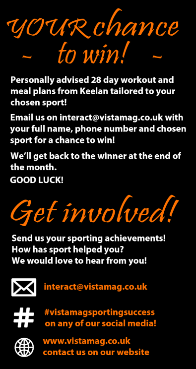
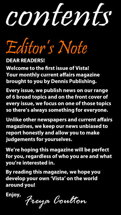
My product is published by Dennis Publishing Ltd – an independent publishing company. Their remit is to ‘inspire, inform and entertain’ people along with saying they are ‘restlessly innovating across different platforms to bring our audience new sources of inspiration, information and entertainment’. I intend to use a short summative slogan to sum up the brand of the magazine and tie in with the publishing company. I intend to inspire, inform and entertain the audience by providing unique content for the audience, such as campaigns, petitions and ways to get involved to inspire and encourage audience interaction and a wide range of current affairs topics to inform them. As Henry Jenkins suggests, audiences are active and prefer to participate in media texts they consume, therefore having interactive features is key to engage the audience.
As my product is aimed at a 16-25 year old socially conscious demographic, socially conscious young people can make their own decisions on political, religious, social etc. views, therefore, do not need biased sources for their news; they simply need an unbiased source to educate them on the world around them. As Curran and Seaton suggest, magazines tend to be repetitive and similar due to large companies being driven by power and profit, however I intend for my magazine to be unique by being politically neutral to simply inform young readers and not influence them with biased news reporting.
Ensuring there is a wide range of representation in my magazine is a key part to the brand identity. I intend to include multiple races, genders, ages and classes to represent an inclusive friendly community for the readers. Diversity and equality have become key current airs issues in recent times, therefore this ties in with the brief of the magazine. There will also be a wide range of current affairs topics covered to represent the interests of a wider number of the audience to ensure many of them will have something they enjoy reading and learning about. As Gerbner suggests in his ’mean world syndrome’ theory, large consumption of violent or negative media leaves the audience believing the world is more dangerous than it is. Therefore, in my magazine, I intend to report both positive and negative news, so the audience get a more balanced ‘vista’ on the world.
Product 2 – website
The colour palette must match that of the magazine front cover, and the website must feature the logo and slogan, to maintain the strong brand identity and make it recognizable to the audience across all platforms.
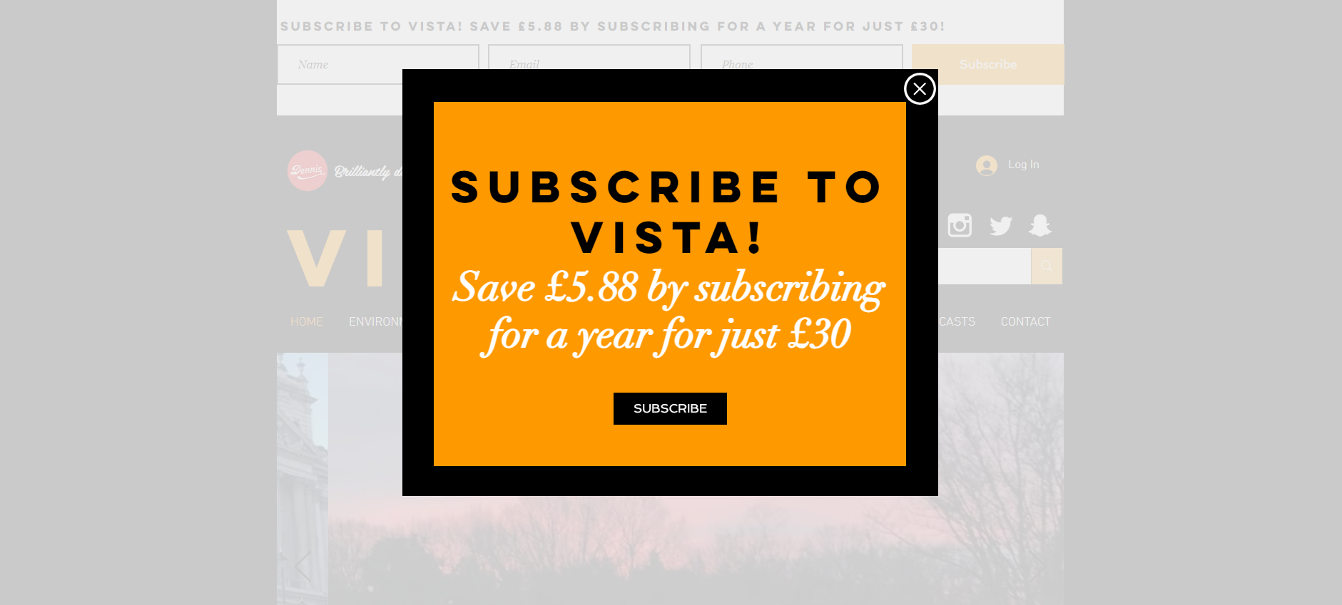
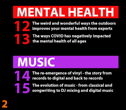
My magazine is released monthly to recap the current affairs of the past month, and therefore there will be 12 broad subcategories of current affairs topics, including environment, culture, politics, science and more etc. Each month it will take in turn which subcategory is the main focus for that month, and this subcategory will feature on the front cover of the magazine. On the website I intend to have 12 coloured boxes which the audience click on to take them to the subcategory they want to read about. This method is much more unique, exciting and interactive than just a taskbar at the top for each subcategory. There will still be a taskbar at the top or down the side to take the audience to pages such as home, contact us etc. but the current affairs subcategories should be in coloured boxes to create more excitement and enthusiasm about current affairs. This is then a USP for the magazine and makes it stand out, as no magazine has this type of attractive branding.
My product is published by Dennis Publishing Ltd – an independent publishing company. Their remit is to ‘inspire, inform and entertain’ people along with saying they are ‘restlessly innovating across different platforms to bring our audience new sources of inspiration, information and entertainment’.
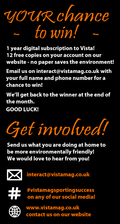
Having a second product allows much more interaction with the audience. Due to the website attracting much more of the audience as print magazine sales are declining, the website must be the strongest feature of the whole branding. I intend to encourage audience interaction, as once the audience have read some of the magazine articles, they may want to read more, so the link to the website will be on the magazine front cover to allow the audience to engage more with the brand, creating cross media convergence. I also intend to encourage audience interaction through features on the website such as polls and audio/audio visual clips to entertain them and so the magazine is more exciting than just reading articles to engage the audience in current affairs. As Shirky suggests, audiences are no longer passive and prefer to interact with the media. Media texts are more open to interaction now, such as comment sections and ways for the audience to get involved, therefore these interactive features are key to encourage audience interaction.
The representation the website will be the same as the magazine representation of social groups: I intend to include multiple races, genders, ages and classes to represent an inclusive friendly community for the readers as well as diversity and equality becoming key current affairs issues in recent times, therefore this ties in with the brief of the magazine. There will also be a wide range of current affairs topics covered to represent the interests of a wider number of the audience to ensure many of them will have something they enjoy reading and learning about.
How do you intend to link your media products to demonstrate your knowledge and understanding of the digitally convergent nature of your media product? (approx. 100 words)
As shown in my research into audience behaviour, the number of print magazines being sold is declining over time due to the increase in technology usage. Therefore, more magazines are being accessed online which leaves room for much more audience interaction. In addition to this, the target audience of my magazine is 16-25 year olds which is the younger age demographic who are more likely to spend their time online.
There will be a link to the website on the print magazine to encourage the audience to go onto the site to find many more features, such as links, polls, Easter eggs and audio clips to entertain them.
On the website there will be clear links to social media pages such as Facebook, Twitter, Instagram etc. for audience interaction and discussion points and deb for other readers to create a community and sense of inclusion.